After yesterday’s feature on what graphic designers can learn from the Oscars ‘Best Picture’ mix-up, designer Brandon Jameson’s reworked the poor typographic design of the winners cards to create a new and improved version.
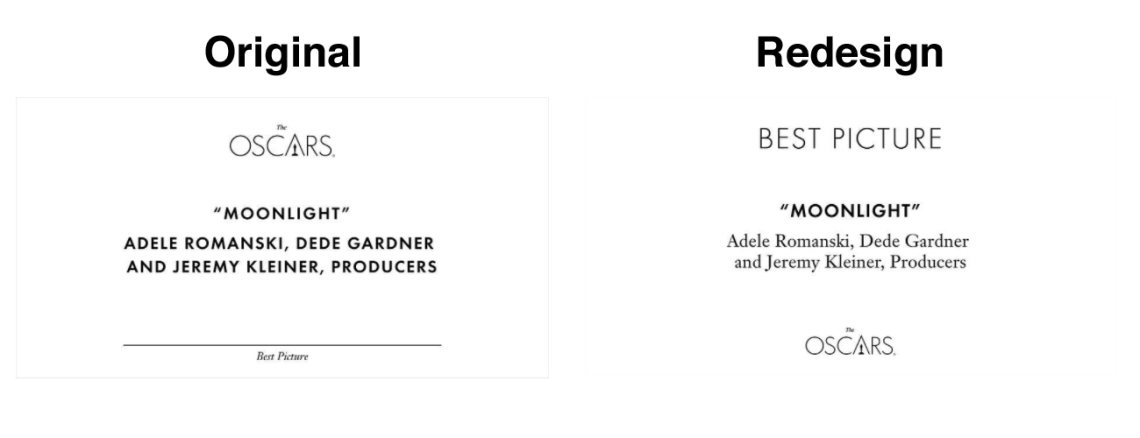
Accounting firm PricewaterhouseCoopers created the original design, which featured the Oscars logo most prominently at the top. This was followed by the winner’s title and the relevant names – all in identical style. The category label comes last in small, italicised letters right at the bottom.
In Jameson’s redesign, he’s moved and downsized the Oscars logo to the bottom of the card.
“I hate unnecessary logo placement and this one was taking up valuable real estate on the card.”
The category title takes its place at the top in large sans-serif letters. “Putting the category in large type at the top assures the presenter they have the correct card, and cues them up to what they’re going to say…the category type is lighter weight, so even though it’s larger, it doesn’t steal any thunder from the winner’s name, which is bolder than anything else on the card.”
The names beneath the winner’s title, that now comes in bold, have been changed to lower case to differentiate the two pieces of information.
“The people reading these cards are sometimes older, they’ve probably been drinking, and they’re in the spotlight in front of their peers delivering some of the most important industry information of the year—these cards should be bulletproof,” says Jameson.
What do you think about the new design?
[via Fast Company, image by Brandon Jameson]
