In case you haven’t heard, this year’s 89th Academy Awards experienced an unfortunate mix-up for ‘Best Picture’. La La Land was initially announced as the winner instead of the rightful Moonlight.
Before producer Fred Berger could complete his thank you speech, producer Jordan Horowitz interjected to announce that there had been a mistake.
“This is not a joke. Moonlight has won Best Picture, Moonlight. Best Picture.”
Although accounting firm PricewaterhouseCoopers – tasked with handing presenters the envelopes with the real winners inside – has taken responsibility for the operational blunder, Reddit user ShinyTile has highlighted another point that, had it been addressed, could’ve possibly helped save the Oscars from its ‘Best Picture’ gaffe.
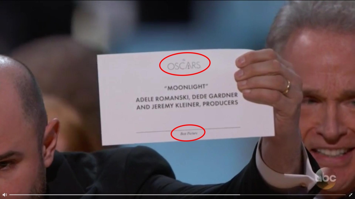
A screenshot of the winning card revealed the announcement’s poor typographic design. The Oscars logo stands as the largest, most prominent visual on the paper because well, attendees must be reminded that they are at the Oscars. Next comes the title of the winner – aligned centre and in quotation marks, which seems fair since it is an important piece of information. There is, however, no distinguishing style between this and the names directly below it. Last but not least, printed in miniscule italicised letters at the bottom of the card is the category label. Is this for ‘Best Actress’ or ‘Best Picture’? Who knows? Please hold while the presenter grabs a magnifying glass.
“Another award show cringe brought upon by bad design: just make ‘Best Picture’ and ‘Moonlight’ in huge text. That’s it. An internally used card doesn’t need an Oscars logo larger than the category,” wrote Reddit user ShinyTile.
Do you agree? It seems that what the Academy Awards really needs is…a good graphic designer.
[via Fast Company, video via Eyewitness News, image via ShinyTile]

So nice post ! I reblogged it, Best !
LikeLike
Reblogged this on Zimia Design.
LikeLike